Choosing the perfect palette matters more than you might think. Colours speak louder than words—they influence mood, perception, trust and action. In this blog I’ll walk you through how to boldly choose right brand colour for your business (and yes, that’s the focus keyword!).
Why it matters to choose right brand colour
Your brand colour is often the first impression your audience gets—before they read your tagline, see your logo or hear your pitch.
-
Colours evoke emotion and send signals: e.g., blue for trust, green for nature, red for energy. Moo+2Looka+2
-
It sets your brand identity and helps you stand out—if your colours are too generic or fuzzy, you’ll fade into the background. Adobe+1
-
Consistent colour use builds recognition. When your audience sees your tone or two, they think of you.
-
Wrong or inconsistent colours confuse your audience—or worse, send the wrong message.
So, the goal is not just to pick pretty colours—but to choose right brand colour that aligns with your values, audience and visual identity.
Step-by-Step: How to choose right brand colour
Step 1 – Define your brand personality & audience
Before picking a shade, ask:
-
Who is my target audience? What age, culture, preference do they have? Seroka Brand Development
-
What adjectives describe my brand (modern, traditional, fun, luxurious, minimal)?
-
What feeling do I want people to have when they see my brand (trust, energy, comfort, excitement)?
Once you know these, the colour choice becomes purposeful.
Step 2 – Explore colour meanings & psychology
Every colour carries associations—warm vs cool, bold vs muted. Moo+1
For example:
-
Blue → calm, stability, professionalism.
-
Red → energy, urgency, passion.
-
Green → growth, nature, health.
Pick colours that reflect your brand’s essence.
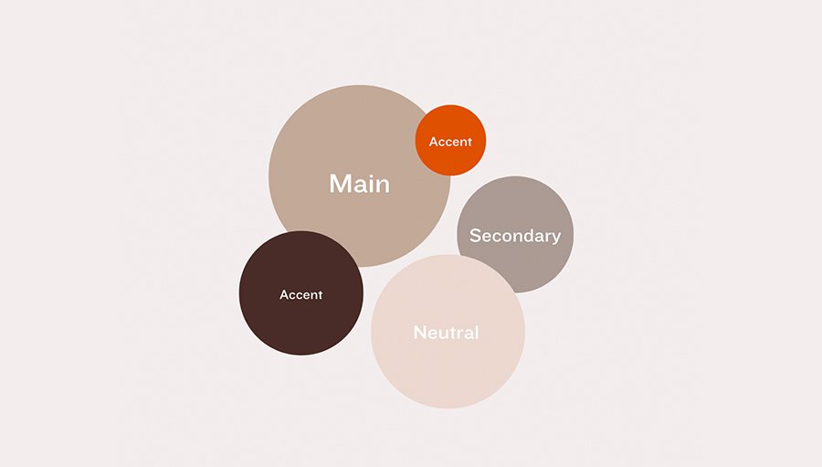
Step 3 – Select a dominant + secondary + accent palette
A good rule-of-thumb: the “60-30-10” rule. Use one main colour (~60%), one supporting (~30%) and an accent colour (~10%). Shopify+1
-
Primary: main brand colour (logo, main visuals).
-
Secondary: supporting tones.
-
Accent: used sparingly (CTAs, highlights).
This gives balance and visual hierarchy.
Step 4 – Check contrast, readability, accessibility
Your colours must work in print, digital, large formats, small formats. Consider accessibility (contrast for readability).
Also, think about producing it—CMYK vs RGB vs Pantone. Graphic Design Stack Exchange
Step 5 – Test & iterate
Mock up your colour palette in real-world usage: logo, website, social media, invitation, etc. See how it feels. Often you’ll refine it. Tools can help. Lisa Furze
Also check competitors—does your palette help you stand out? Moo
Step 6 – Document your brand colour guidelines
Once you pick your palette, document the HEX/CMYK/Pantone values, usage rules (when to use which colour) so your brand remains consistent. Consistency = recognition. Looka
Common Mistakes to Avoid When You choose right brand colour
-
Choosing too many colours: A messy palette dilutes your brand. Use just 2-3 core colours. Seroka Brand Development
-
Ignoring context: A colour might look great on screen but murky in print.
-
Copying competitor palette: You want to fit your industry, but still stand out.
-
Neglecting culture/local meanings: Colours may carry different meanings in different regions. Moo
-
Changing colours too often: Frequent shifts confuse your audience and waste brand equity.
Applying this to your business – Tips for your design brand
Since you run Inkrete ✨ Designs and offer logos, invitations, resumes, biodata templates, here are tailored tips for you:
-
Your preferred brand colours: red (#d73739), black, white (and gradient). Use red as your dominant, black/white as your neutrals.
-
On invitation/resume templates, test how your red stands out—people should remember you.
-
On digital vs print, ensure your red reproduces well (RGB vs CMYK).
-
For accent, you might choose a subtle grey or a metallic gradient tone (if you do luxe invitations).
-
Document your palette in a style-guide for yourself and any collaborators.
Final Checklist to choose right brand colour
-
Defined brand personality & target audience
-
Researched colour meanings & aligned with brand values
-
Chosen dominant colour + secondary + accent using a balanced rule
-
Tested for accessibility, print/digital consistency
-
Compared against competitors for differentiation
-
Documented palette values + usage guidelines

